
Back
.avif)
This portfolio showcases a continuous journey of refinement and self-reflection. After the initial release, I thoroughly evaluated its strengths and areas for improvement. My aim with this updated version was to boost its visual appeal and offer a clearer narrative of my design process and decision-making.
When I came back to the project, I started by looking at the old designs and the research I had done the first time. I added to that by exploring new portfolios, connecting with different people, and reading through updated forum posts. I wanted to really understand what wasn’t working in my previous designs and why
.avif)
In my first portfolio, most pages felt too simple, while the homepage was overly busy. It was clear, but not memorable. This time, I aimed to balance clarity with visual impact.
The first version of my portfolio focused too much on polished outcomes. I wanted this update to show more of how I think, what informed my choices, the challenges I faced, and how I adapted along the way
One of the biggest differences this time was in the layout. I carefully adjusted spacing, font sizes, and alignment to improve the visual flow and bring cohesion to the overall experience.
The original case studies felt disconnected. I rewrote them with a stronger narrative arc—adding clearer headings and structure to guide readers naturally through each project.
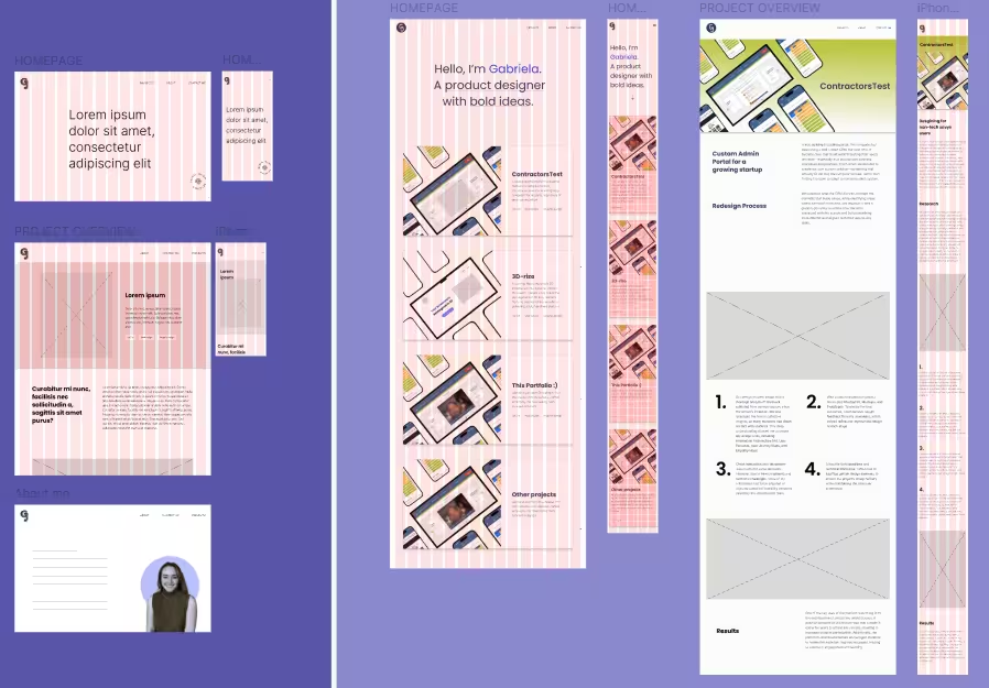
This section shows the original version of the homepage before the redesign. I included it to highlight some of the key changes I made later on. In the current version, I introduced more hover-based interactions to create visual interest without overwhelming the user. The result feels cleaner and more professional
.avif)
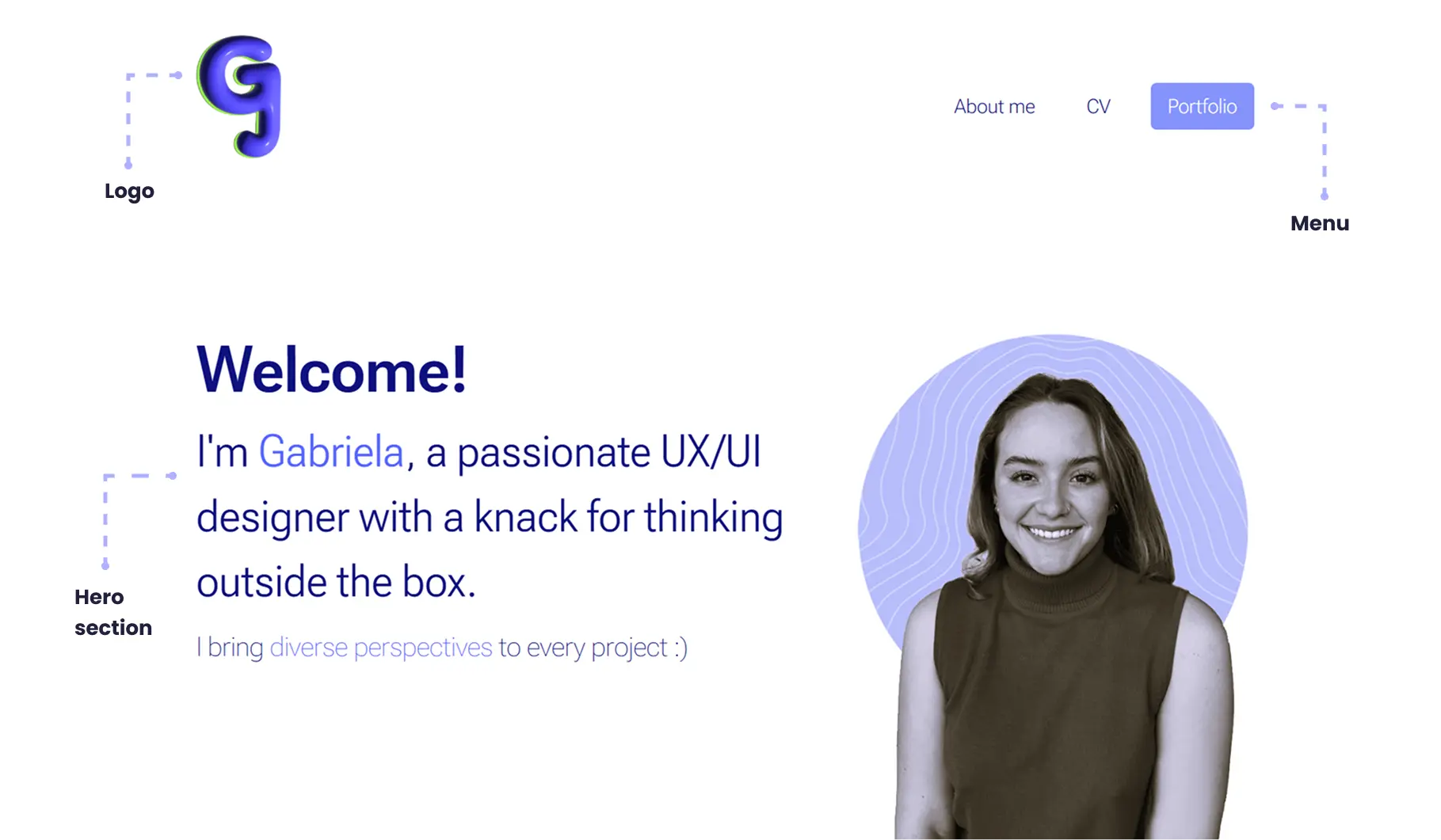
In the first version, I experimented with a 3D logo, but it didn’t match the rest of the page, which used mostly flat, 2D elements. This time, I went with a simpler logo that blends into the layout without drawing too much attention.
The original layout had too much going on, which made it hard to know where to focus. In this version, I kept things minimal to make the hero text the clear focal point—no extra distractions..
I switched the menu text to uppercase for a more impactful look. Since there aren’t many items, readability wasn’t compromised. I also removed the original button to keep the layout simple and aligned with the overall tone.
Beyond layout and structure, my research and testing surfaced deeper insights that shaped this new version in more subtle but important ways. I learned that recruiters spend only minutes on each portfolio, so key takeaways need to be immediately visible. Readers lose interest quickly when there’s no clear path or payoff. Small interaction details—like hover effects or scroll pacing—made a surprising difference in engagement. And usability testing helped validate what felt intuitive versus what simply looked good.
I see portfolios as a never-ending work in progress. As we grow, they grow with us. This new version reflects that evolution—offering a more intuitive and enjoyable experience that better represents how I think and design today